Home office — Let intelligent design nurture your imagination
News
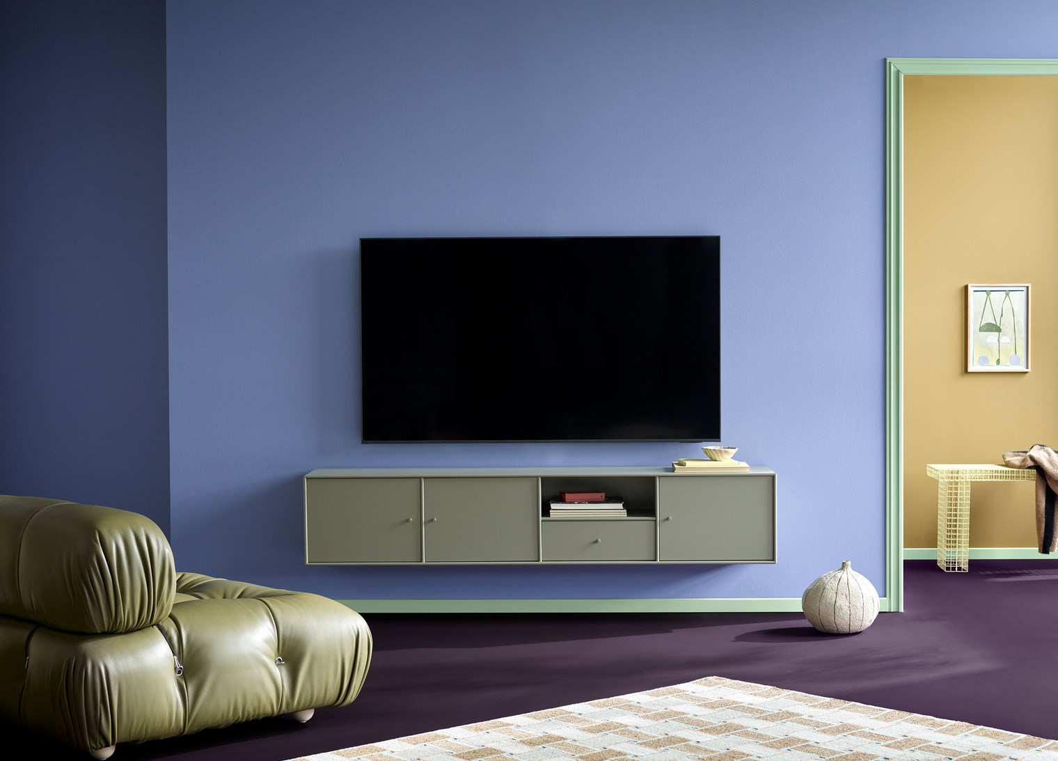
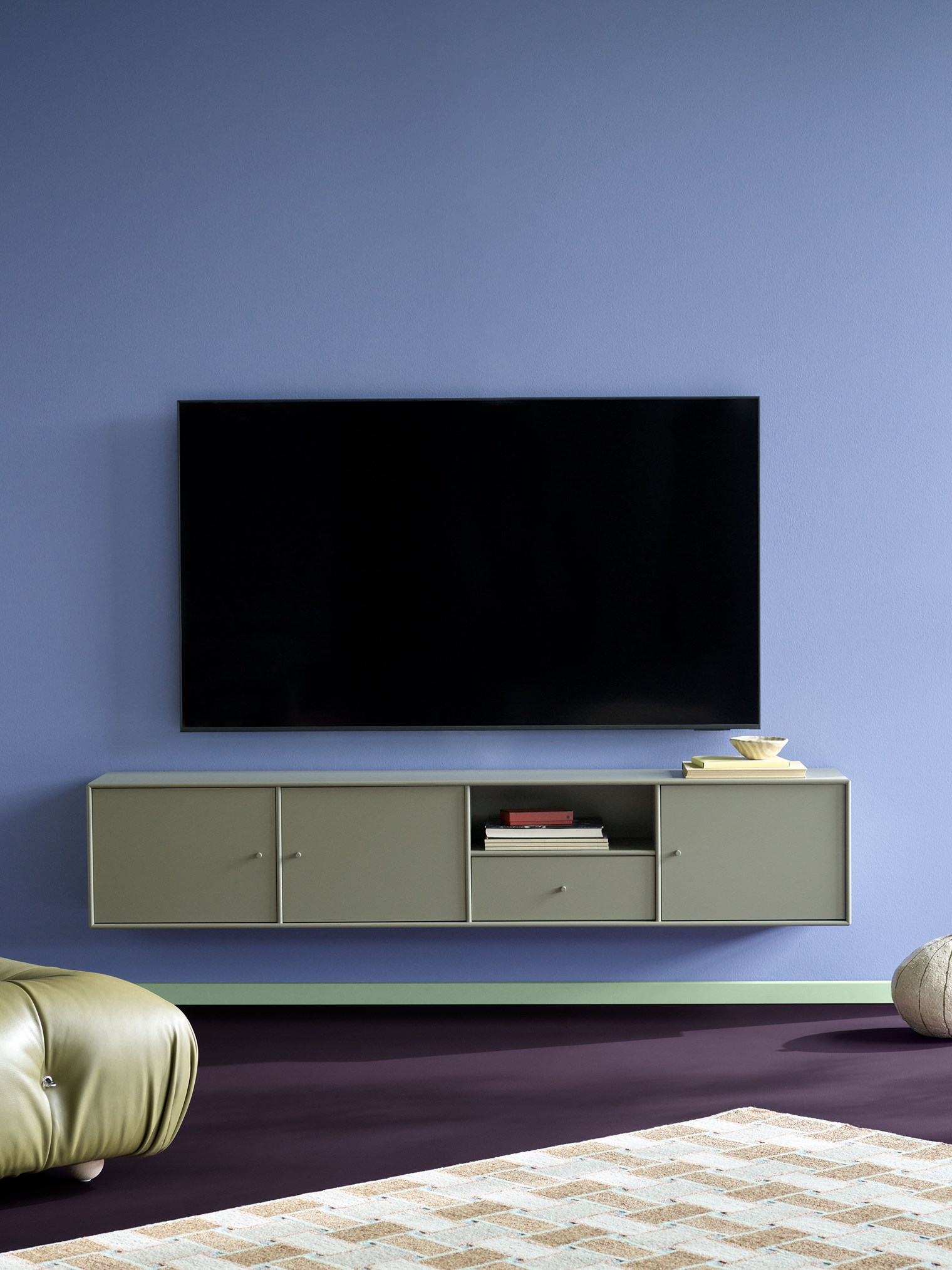
Montana TV & Sound – Enjoy the visual silence
Experience effortless elegance and enhanced functionality in the new additions to our TV & Sound assortment. Discover new features for your TV setup.
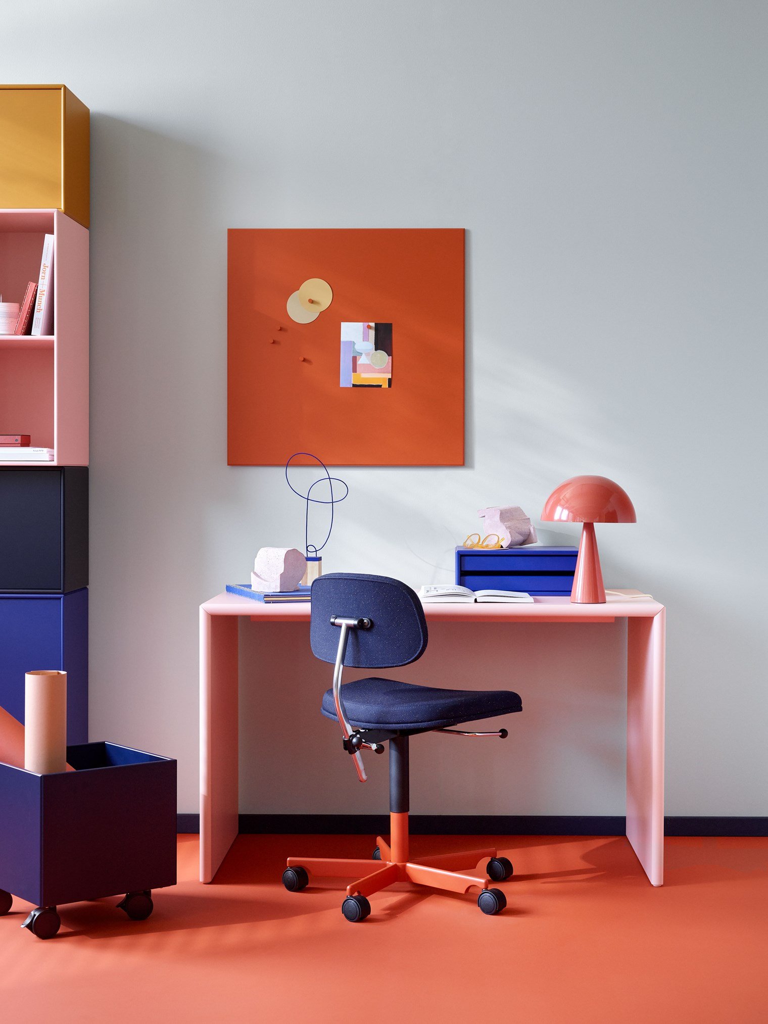
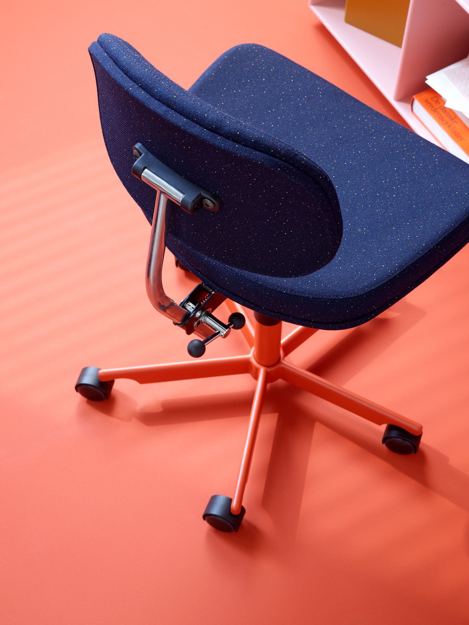
The better you sit, the more you get done
The versatile Kevi chair series has made its mark globally, gracing universities in the UK, primary schools in Denmark, and design offices in Japan. Available in various sizes, colours, and upholstery options, it encompasses office chairs, dining chairs, and stools.
EU Ecolabel certified
A label of environmental excellence that focuses on a product's entire lifecycle, from raw material extraction to production, distribution and disposal.
Manufactured in Denmark
Since 1982, Montana has been designed and manufactured in Denmark by skilled craftsmen on a high-technological production site.
5-10 year guarantee
Montana is a buy for life product that is known to be passed on from generation to generation. However, we have your back in the unlikely case your purchase is flawed.
Environment and quality
At Montana, we take our environmental responsibilities seriously. Since introducing our own set of environmental accounts in consultation with The Danish Environmental Protection Agency over 25 years ago, we have achieved a number of certifications – most recently the PEFC certification, meaning that most of Montana's MDF products are now made from PEFC certified wood.
Inside the creative mind of – Karoline Nygaard Petersen
Colour enthusiast and Creative Lead at Montana, Karoline Nygaard Petersen, describes durability, patterns, and imperfection as special sources of inspiration. “I don’t take interior design too seriously. It’s not so important if it’s perfect, I feel much better when it isn’t.” Take a peak inside Karoline’s playful and personal home and be inspired by her take on colours.

Creating good design demands honesty and respect
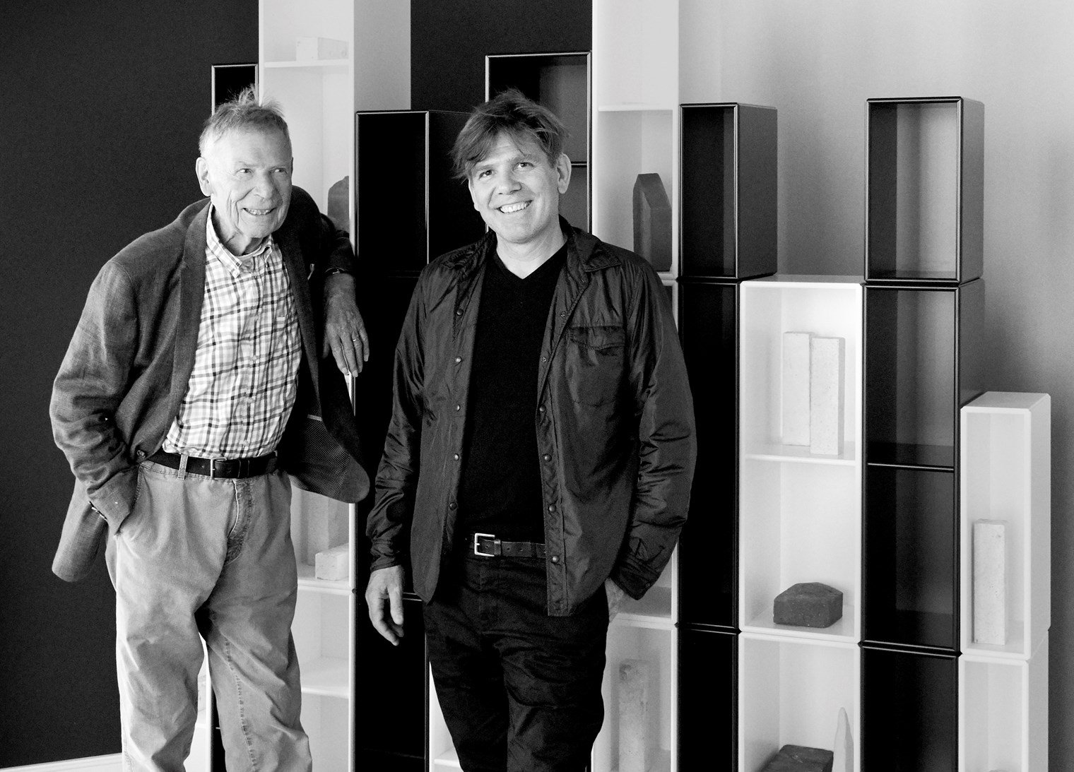
Montana Furniture is a family-owned company, established in 1982, leading within storage and furniture for private homes and contemporary office spaces. The company is founded by Peter J. Lassen, who is also the designer of the Montana system.
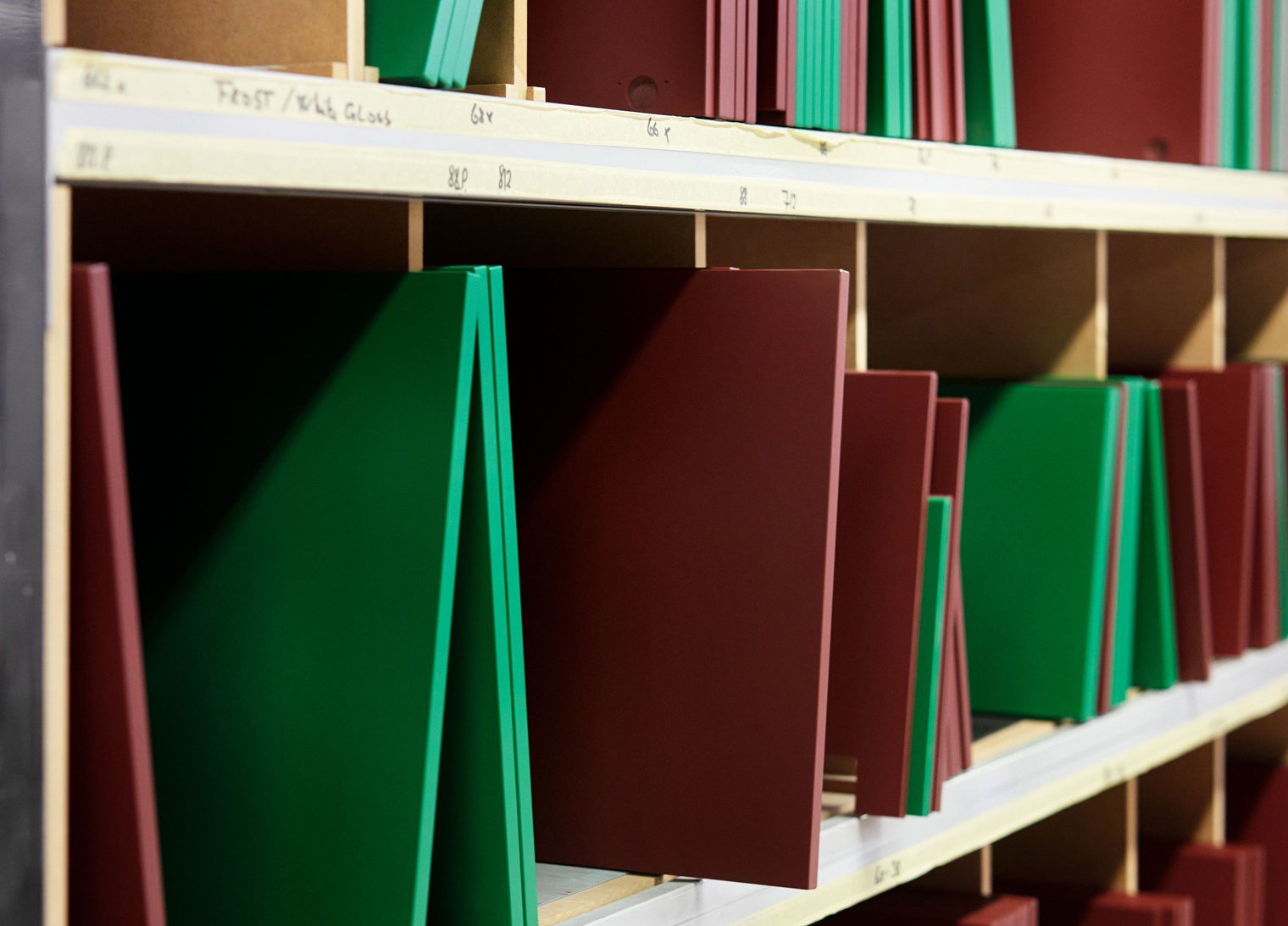
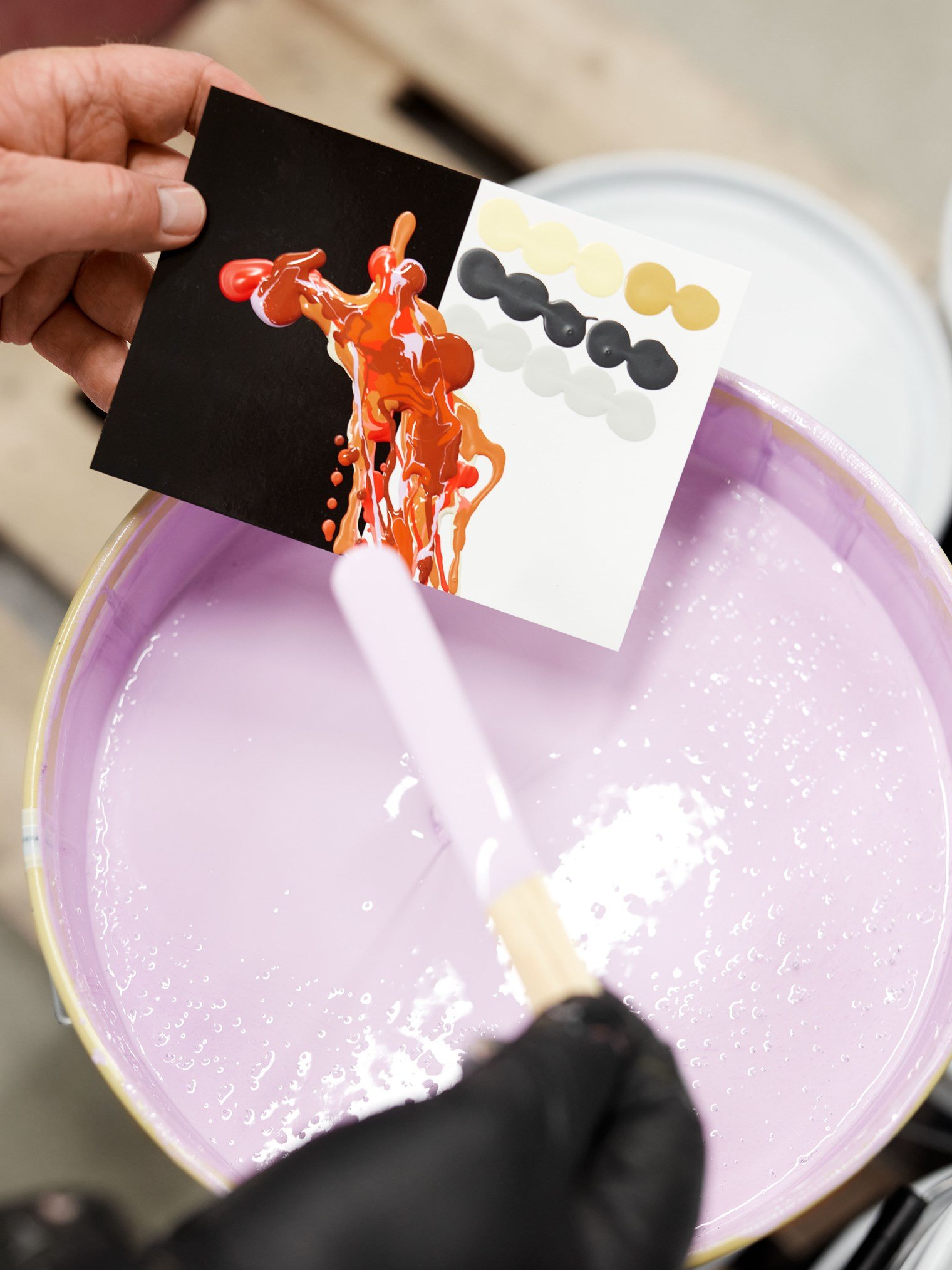
All Montana modules are designed, developed and made in Denmark. Every day, in a small town on the island of Funen over 140 professionals work hard to uphold the highest standards of processing, painting and assembling – making sure that your Montana furniture will last a lifetime.
Montana for professionals
Visit another part of our website designed for professionals within interior design. At Montana we are passionate about helping architects, designers, buyers and project managers develop functional and aesthetic professional environments. Find our sales team, product information and other resources.